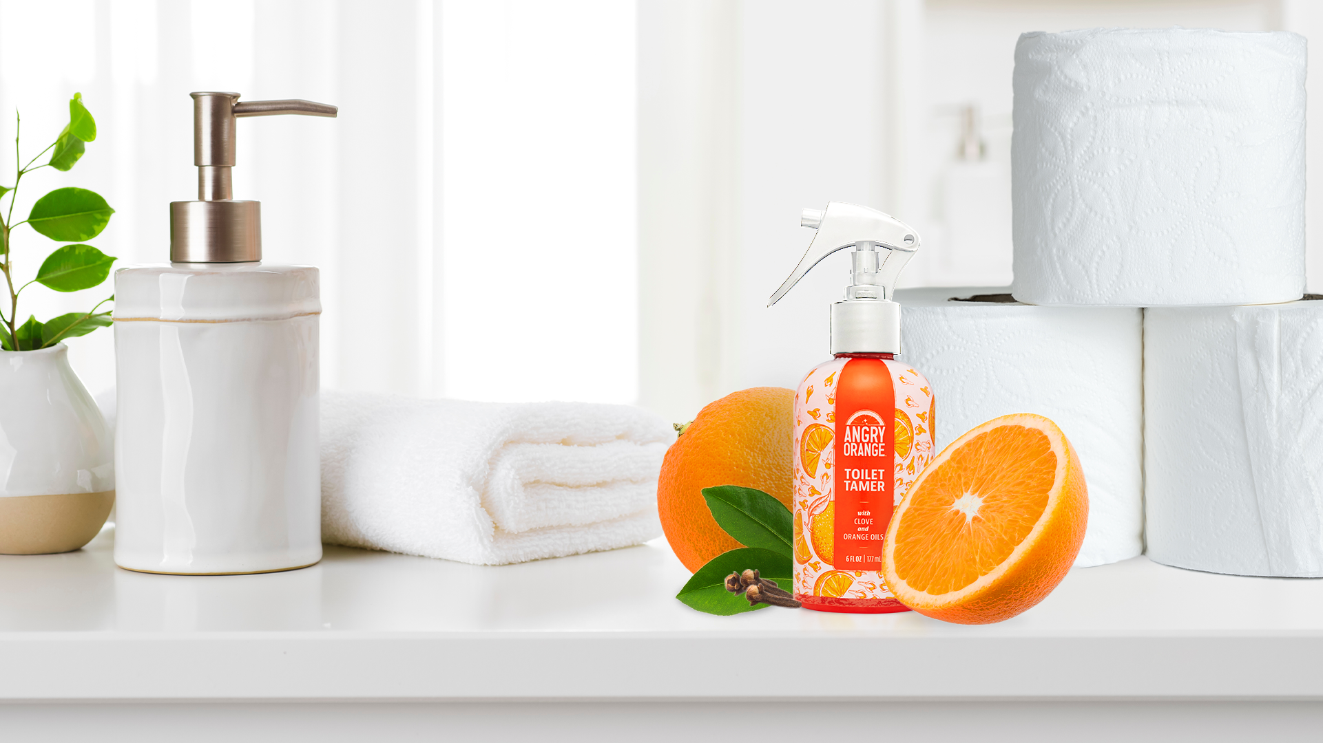
Toilet Tamer
PACKAGING / ILLUSTRATION / ART DIRECTION / BRANDING
BRIEF
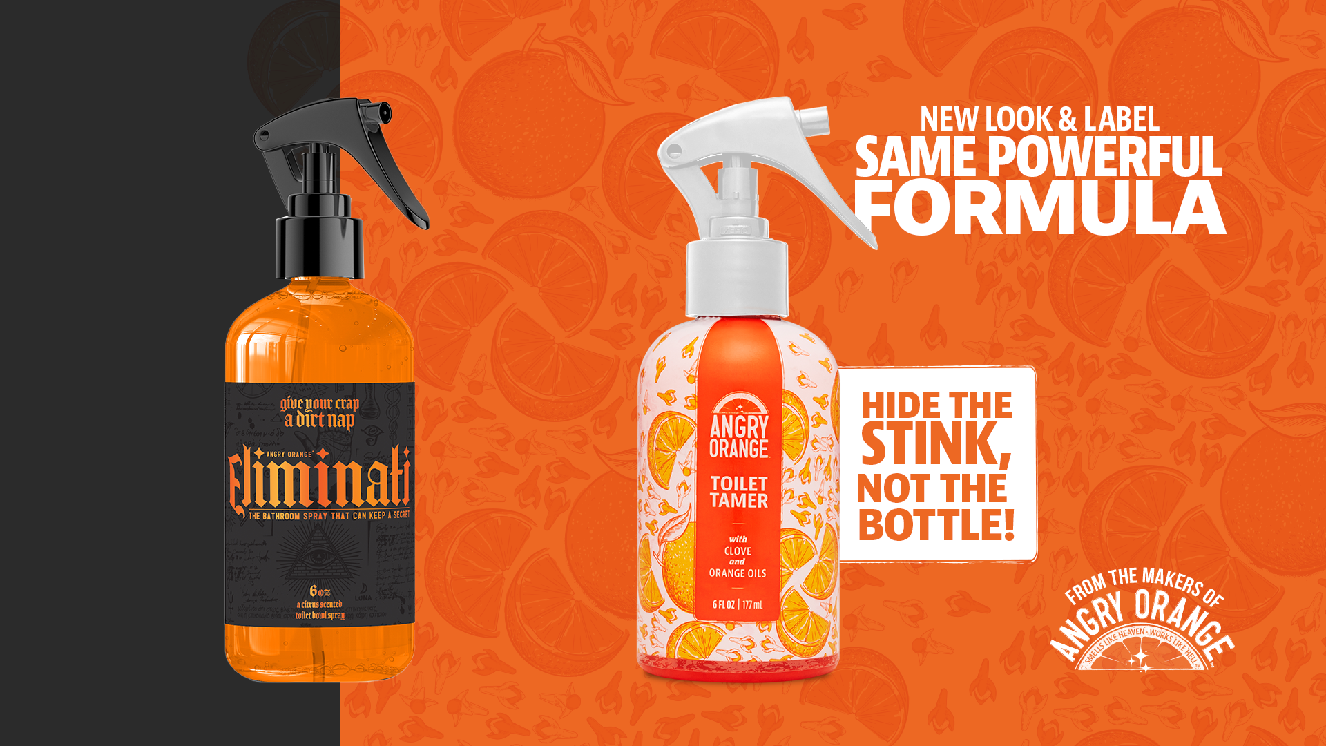
The current Eliminati branding, both look and feel and name, are not resonating with consumers. The brand team would like to move be more competitive in the category of toilet sprays. The branded searches for the product were not high or gaining traction for the brand; it is one of the products that was struggling.
GOAL
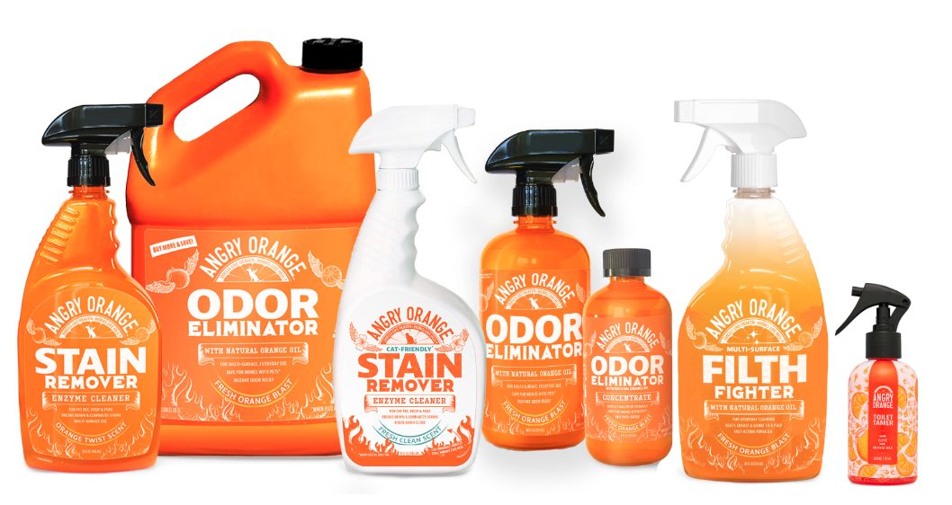
Packaging and Amazon creative assets that are more cohesive and consistent with Angry Orange product line. A new product name that more clearly reflects what the product is while maintaining the humorous brand voice & tone. Updating specifically the Amazon page to better reflect the product and it’s benefits to consumers.
CREATED IN COLLABORATION WITH Lara Harris Associate Creative Director, Val Delgado Associate Copy Director, Britney Jackson Senior Copywriter, Mike Fahey Product Photography, Sara Law Branding, Concepts, Packaging & Art Direction
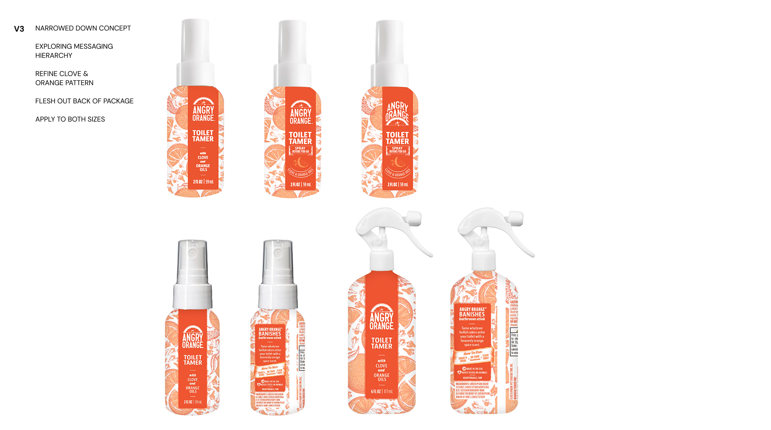
Process
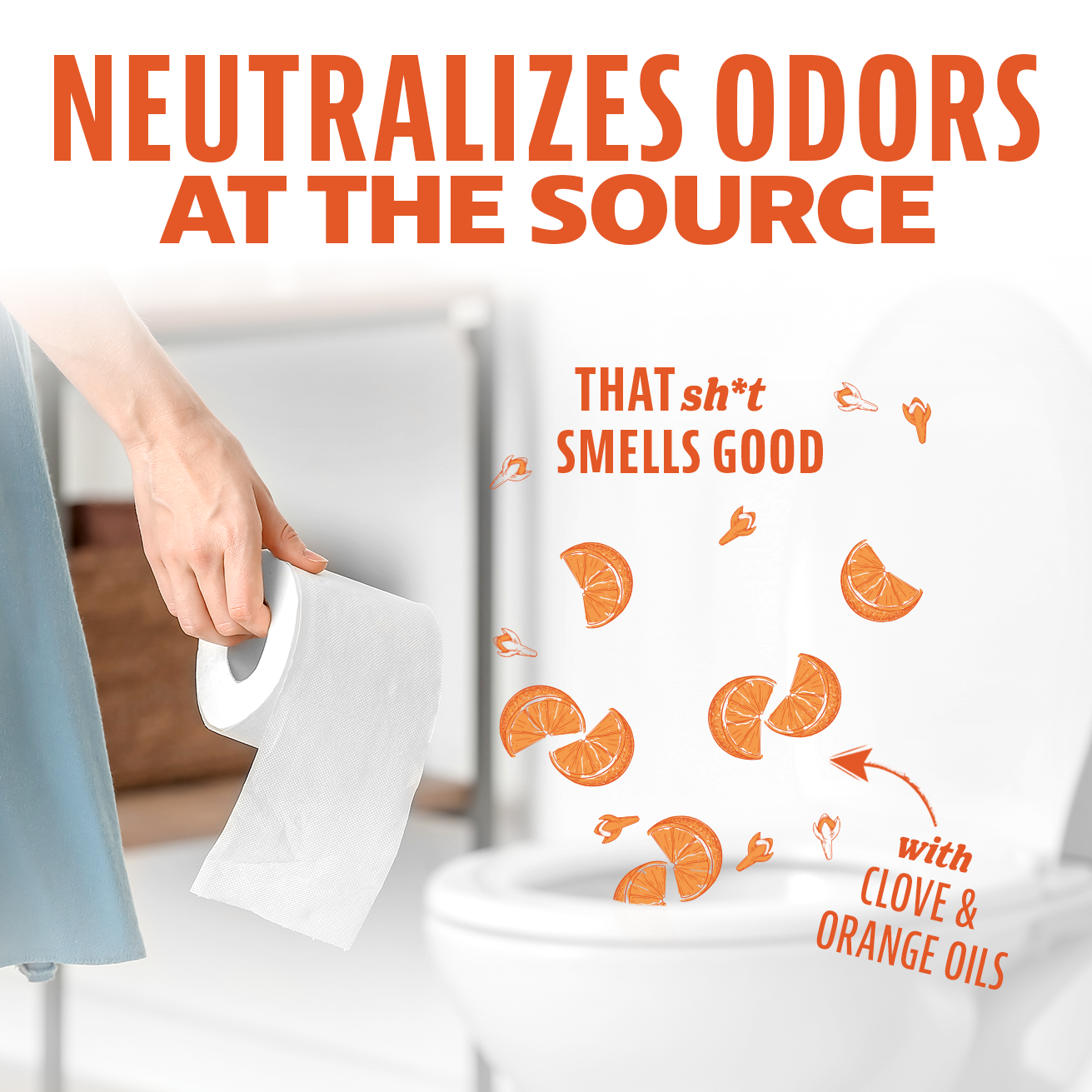
As a team, we explored both naming and look and feel on the packaging as the starting point of the rebrand. After testing initial concepts, the data showed that concepts that were more vulgar or potty-mouthed (Turd Terminator or Poop Punishing) might alienate or cause people to avoid purchasing Angry Orange toilet spray over more palatable brands. We also found it important to highlight the unique scent of our product, citrus and clove. Angry Orange’s citrus scent carries recognition and clout with existing brand customers so we wanted to reinforce that this is just as good as the brand’s pet products. Cross-functional partners felt strongly about the new branding being more discreet and aesthetically pleasing for those who choose to leave it out in the bathroom.
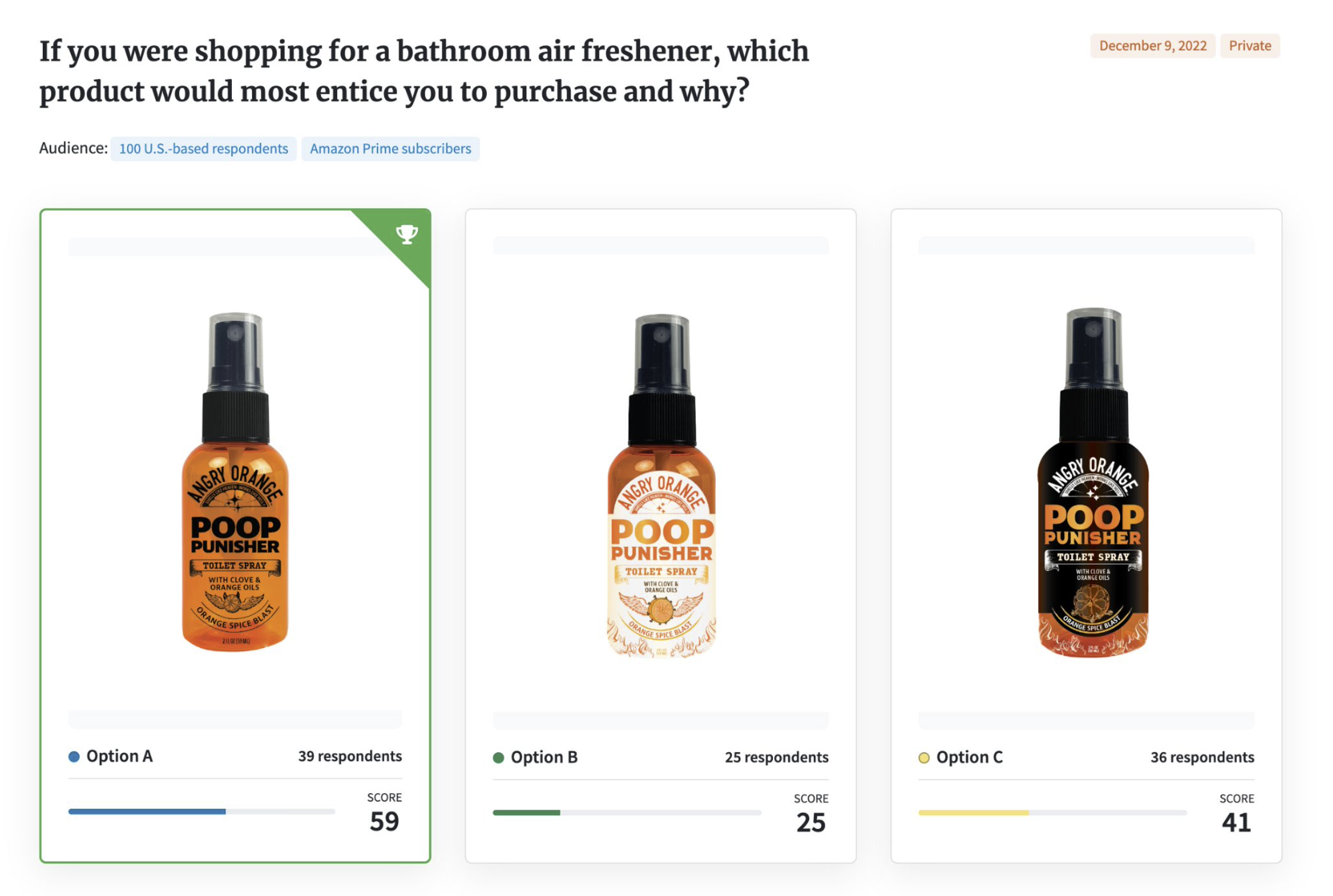
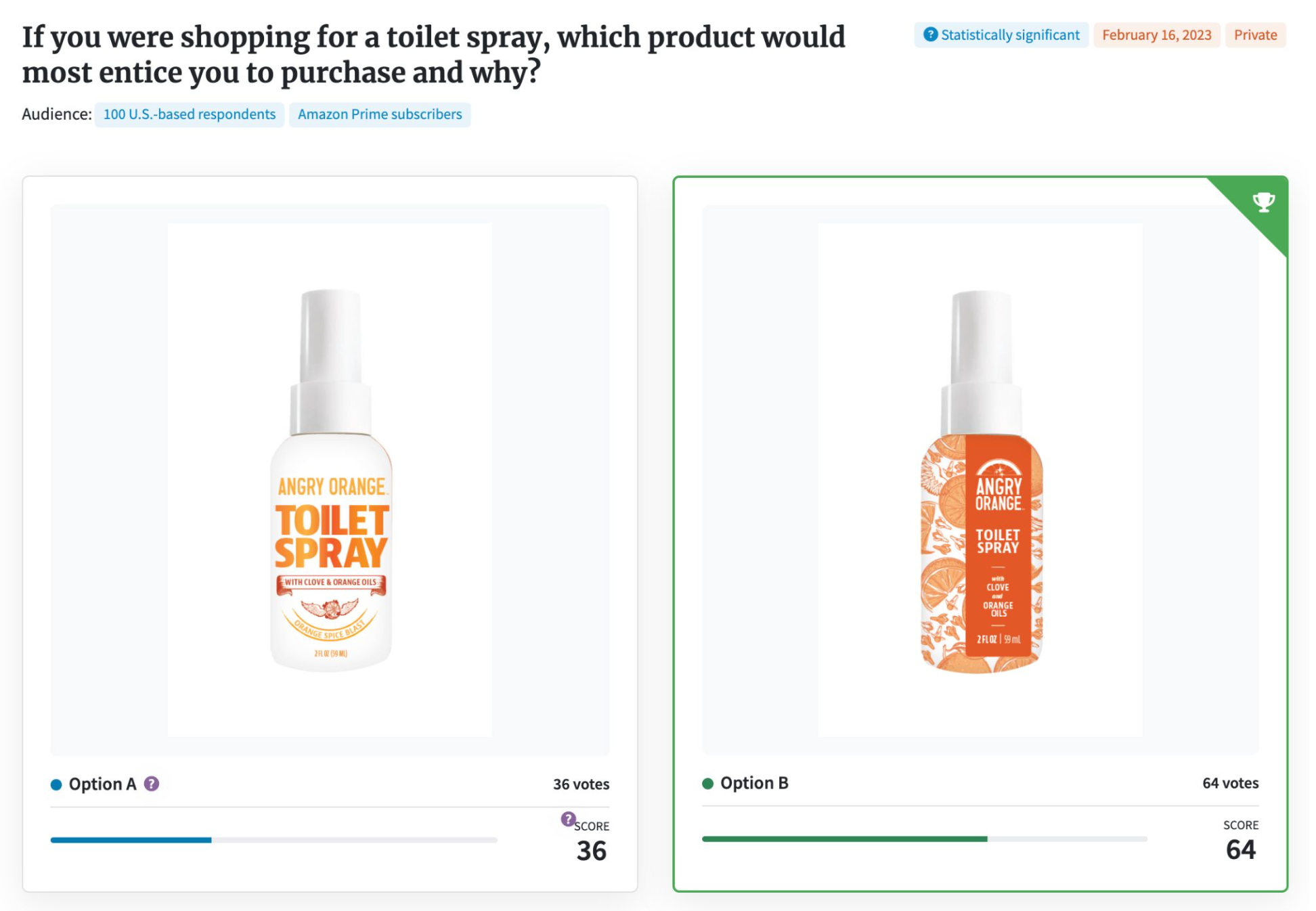
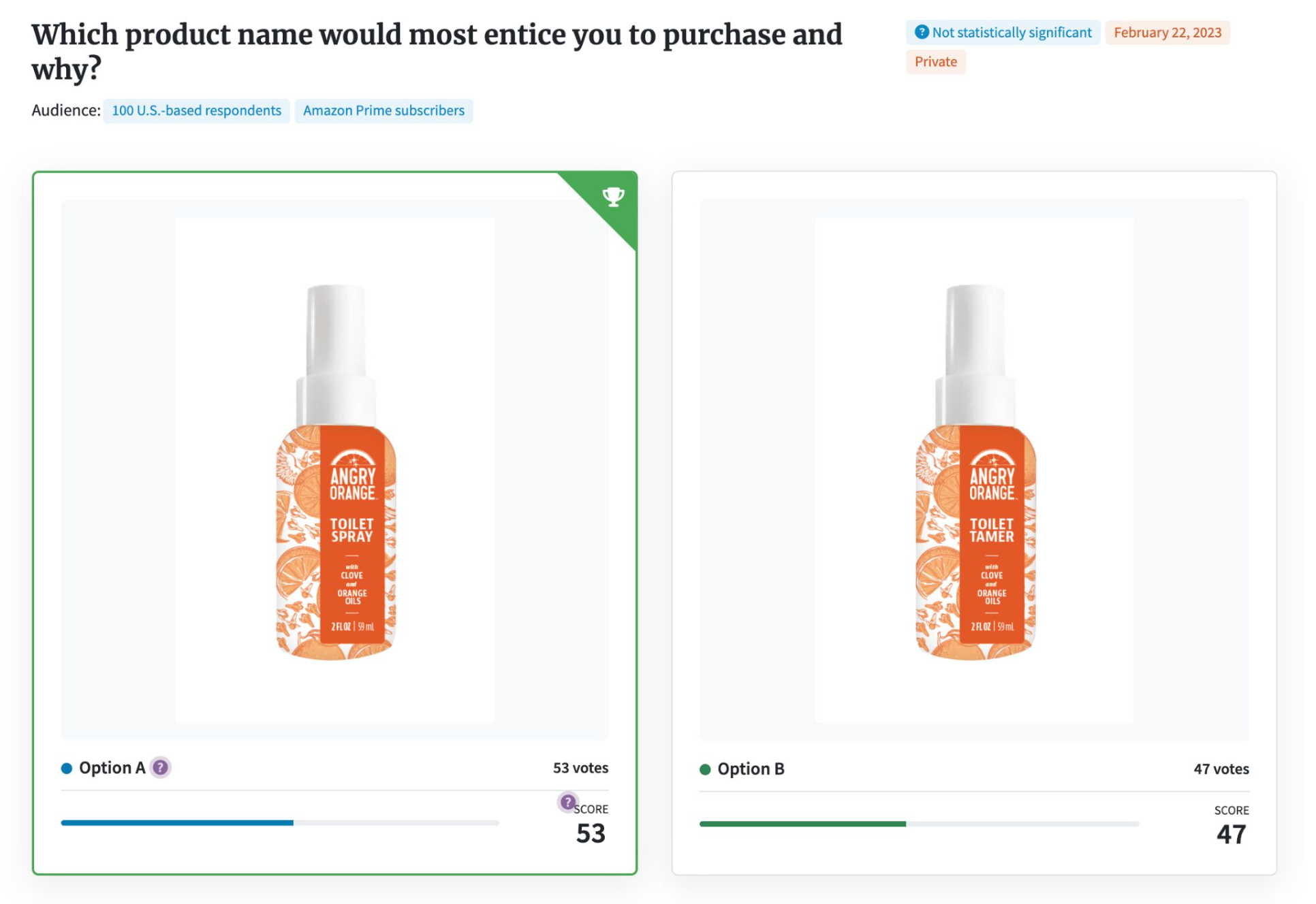
Testing
Although none of the tests were statistically significant, the comments left allowed me to find patterns and trends in the test group’s decisions. Most helpful was discerning that vulgar word choice or potty humor really turned people off and could be the difference between a customer buying our toilet odor eliminator versus a customer. Trends test groups positively reacted to included the scent cues being visual and prominent and more aesthetic and discreet packaging. Although test group did postively react to the black and orange look and feel, cross-functional team members did not see this as aligned with their brand goals and long-term brand strategy.


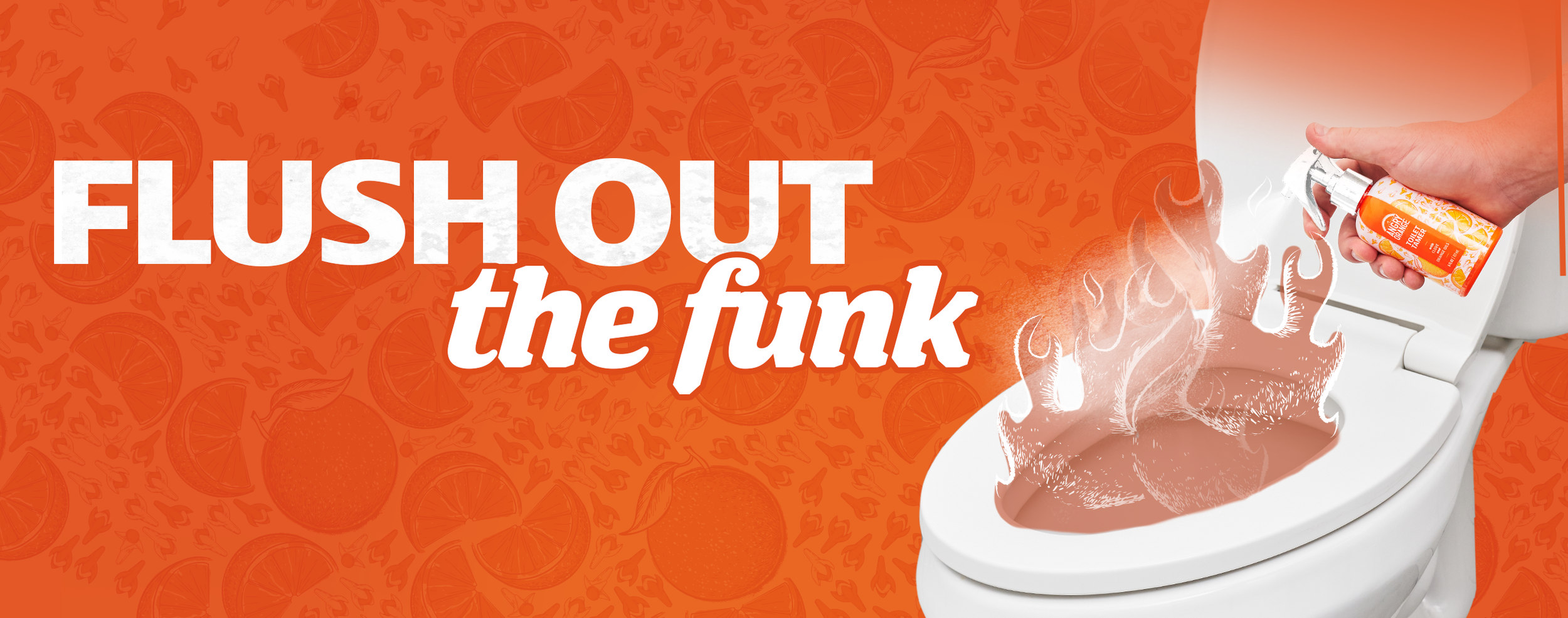
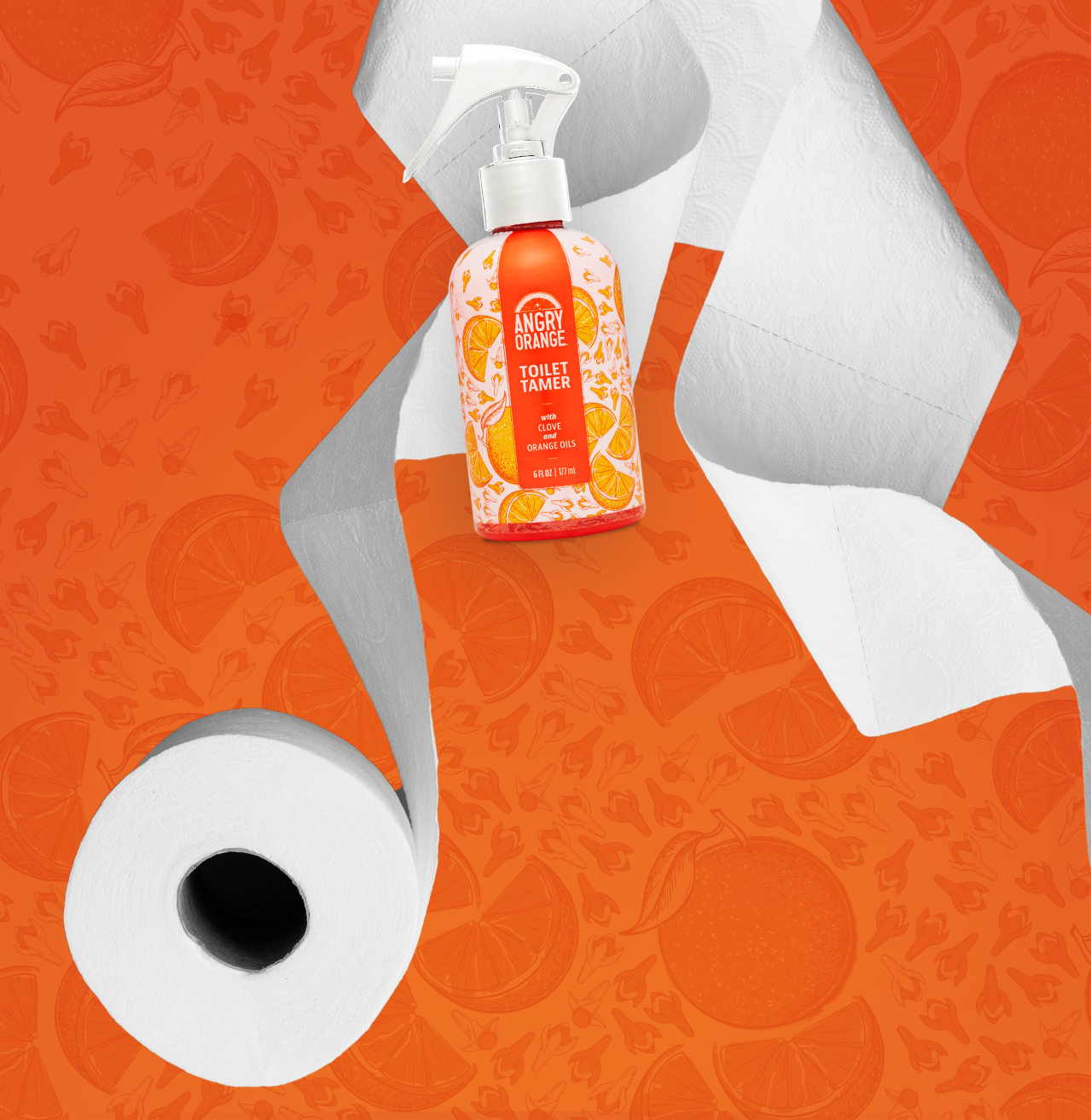
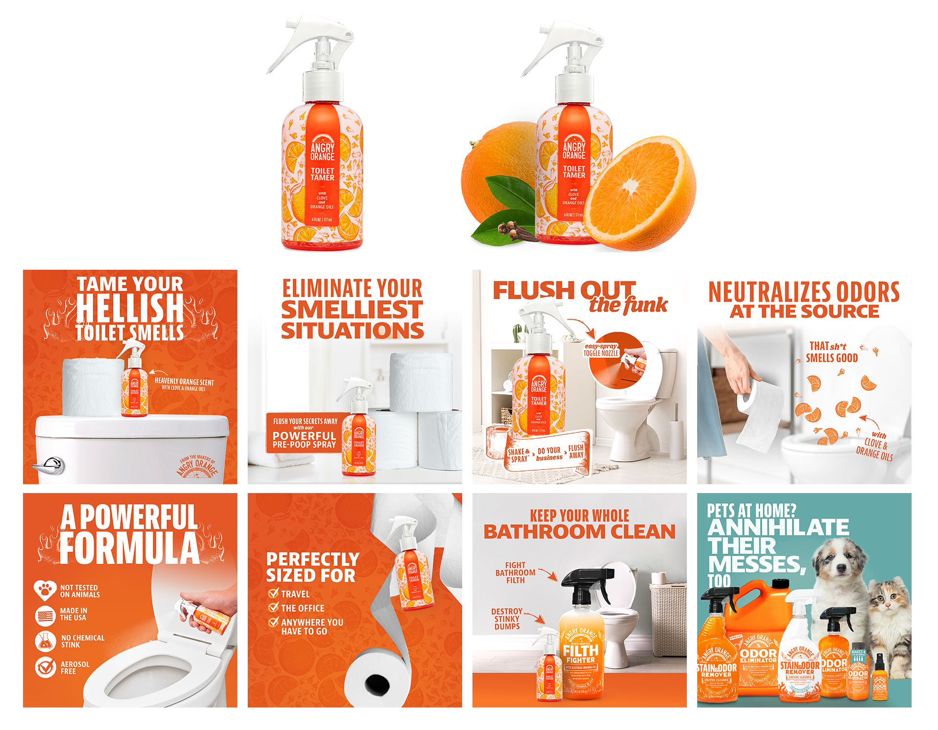
Final Packaging & Creative
Learnings
Since launching the initial creative, the rebrand has gained traction with minimal marketing efforts proving the packaging updates are resonating with Amazon shoppers. Additional improvements are in progress to better compete in the bathroom odor eliminating space including adding imagery of real oranges and cloves earlier on in the listing photos, simplifying copy and overall focusing more on the scent, than toilet paper or bathroom imagery.