Dermora
PACKAGING / ILLUSTRATION / ART DIRECTION / BRANDING
BRIEF
The brand management team wanted to rebrand Dermora to better compete within the eye gel category, particularly on Amazon but also to set the brand up for success in pitches to retail partners. A priority was leaning into the updated brand tenant of “fresh and simple.” Secondary goal was to capture giftable moments and a younger target consumer.
The brand had mismatched logos and inconsistent look and feels across the product lines so we also needed to create a design language that would translate across multiple product types (and potential future new products) as well as several scent varieties.
CREATED IN COLLABORATION WITH Lara Harris Associate Creative Director, Val Delgado Associate Copy Director, Kenzie Kutzer Senior Copywriter, Sara Law Branding, Concepts, Packaging & Art Direction
Process & Testing
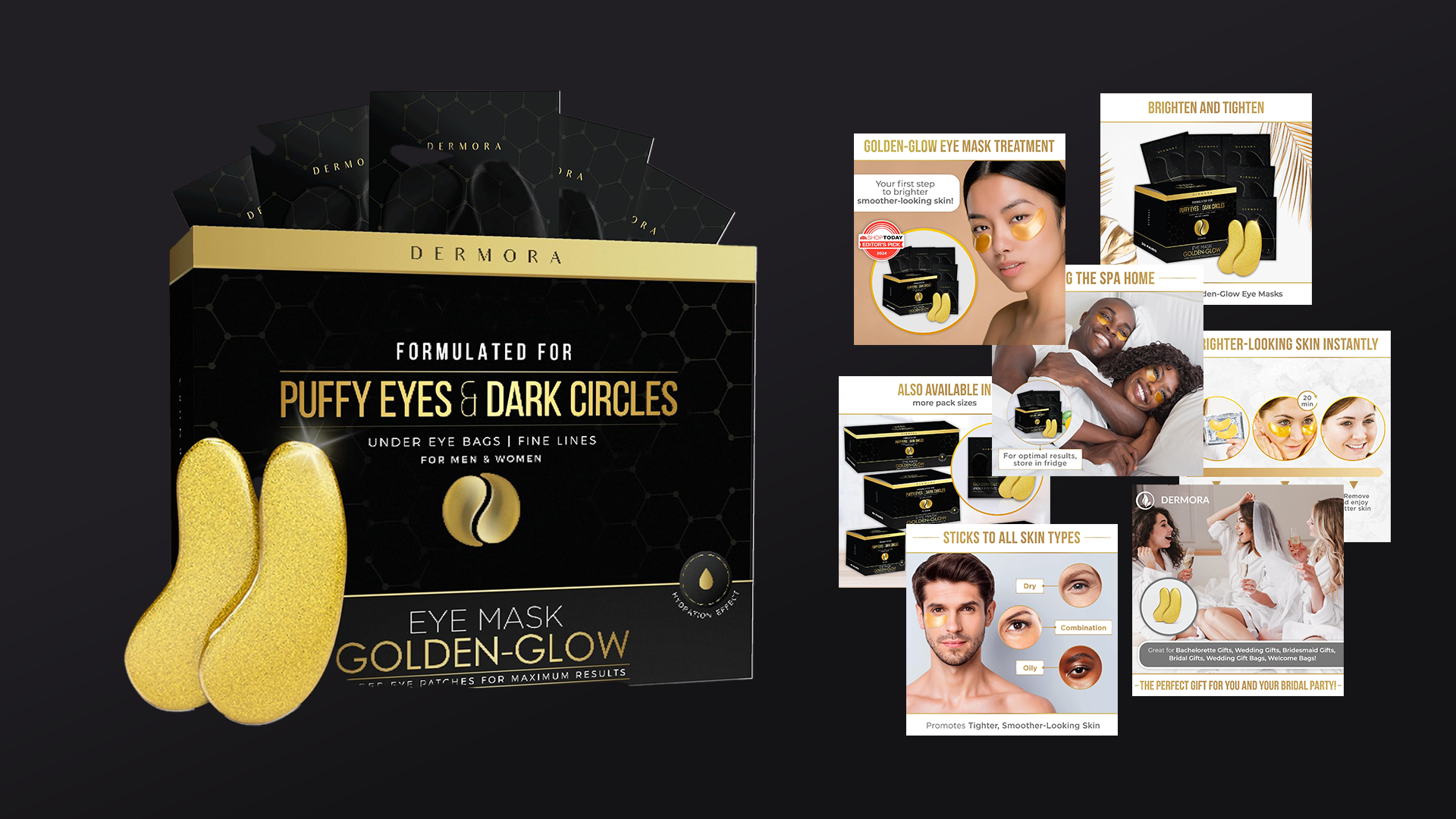
Before
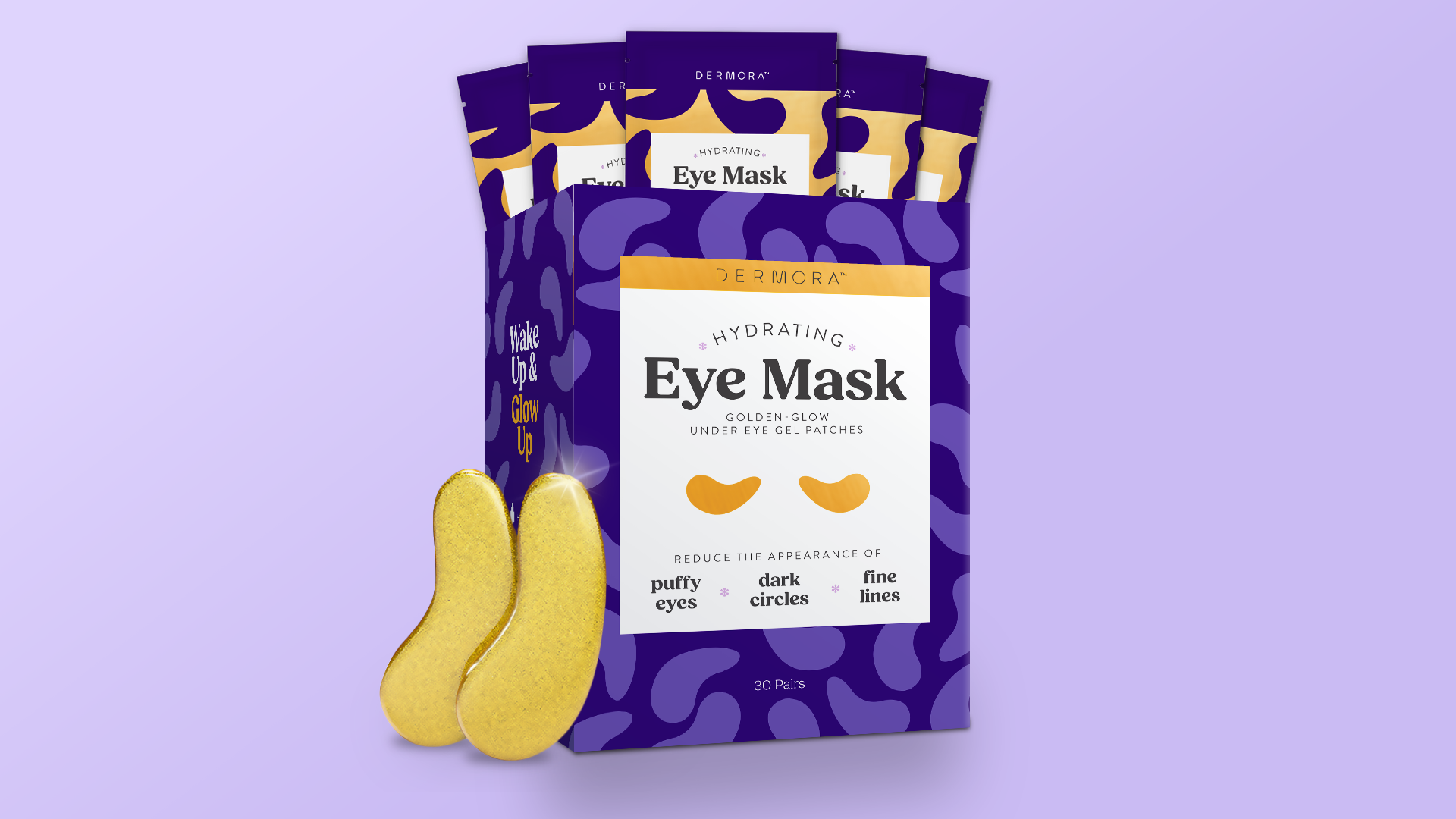
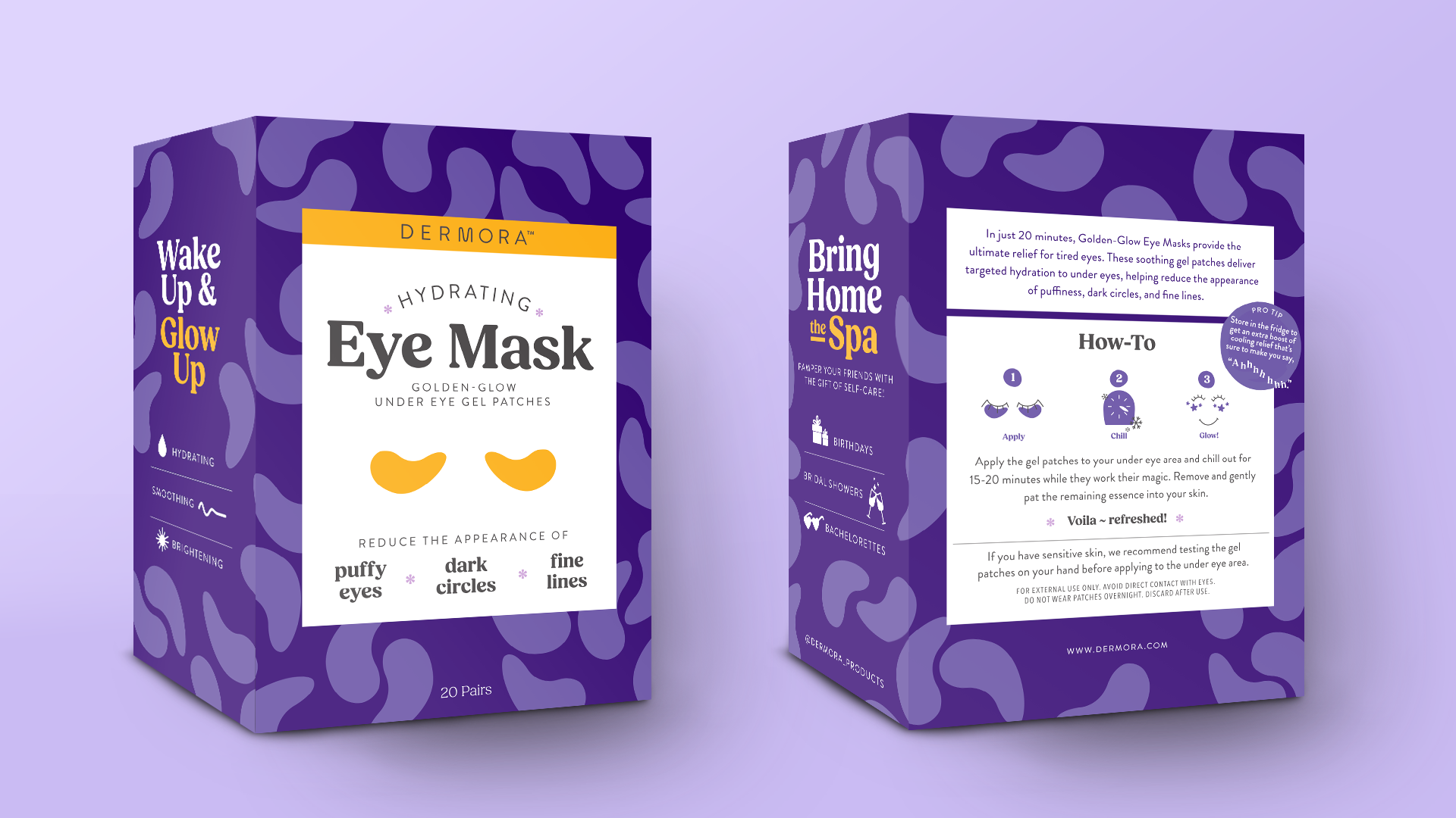
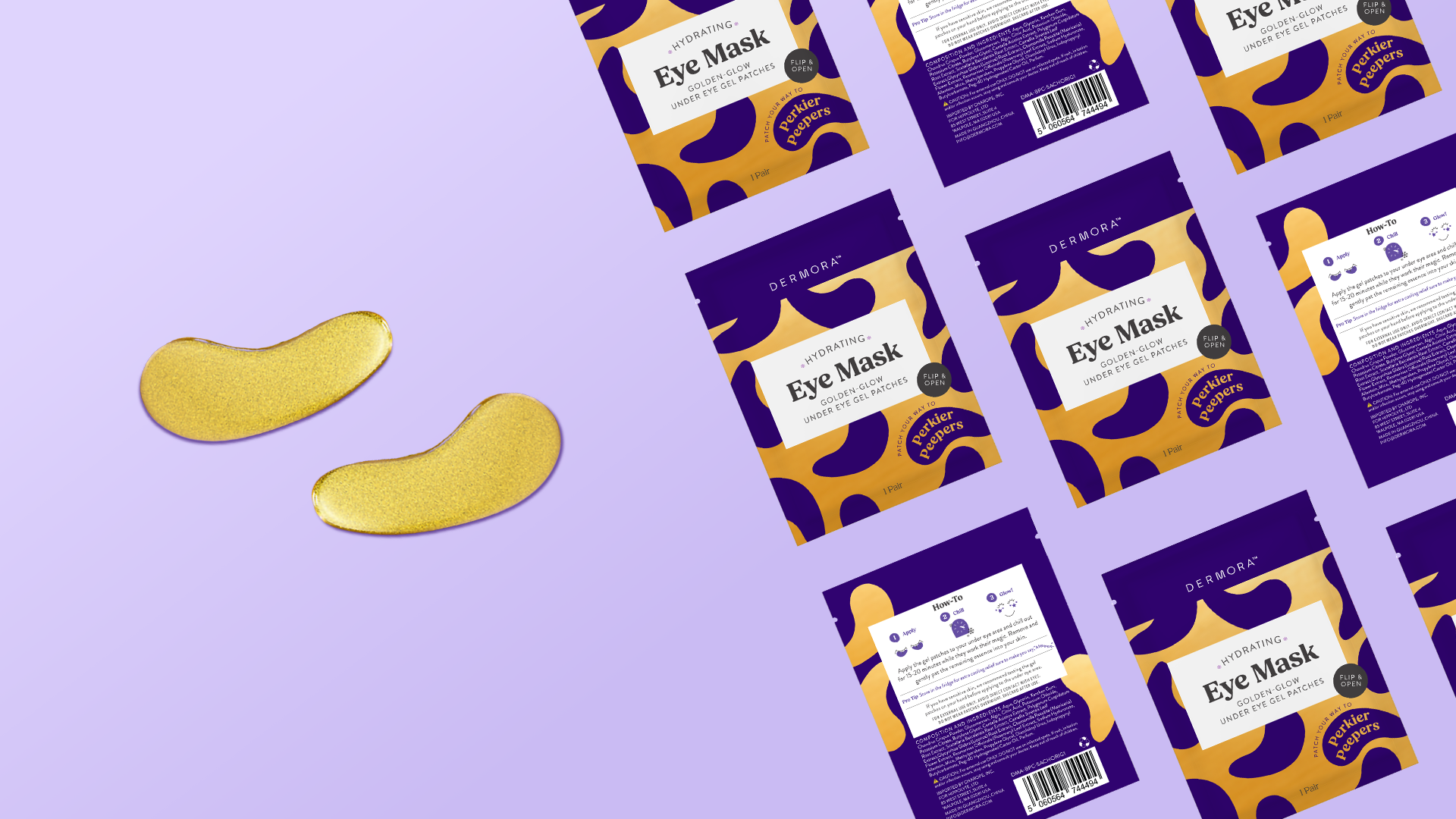
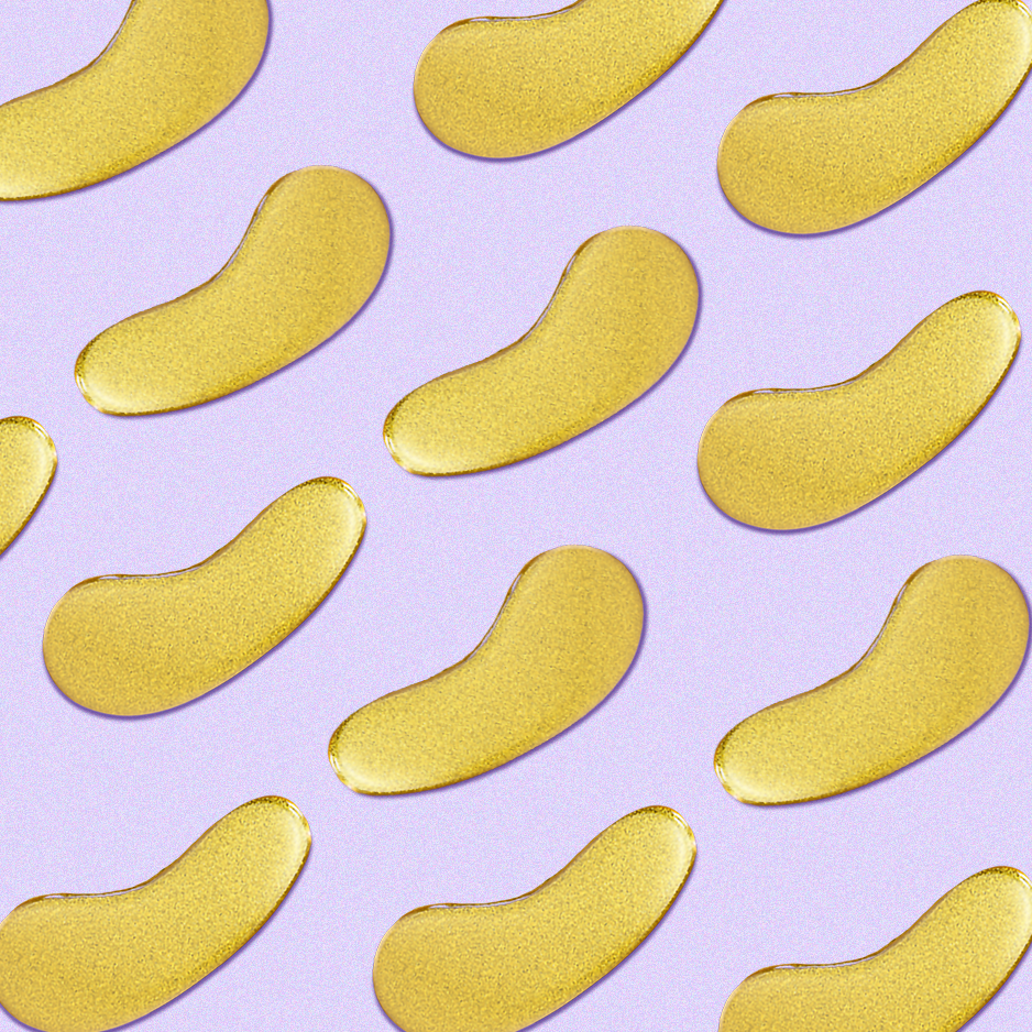
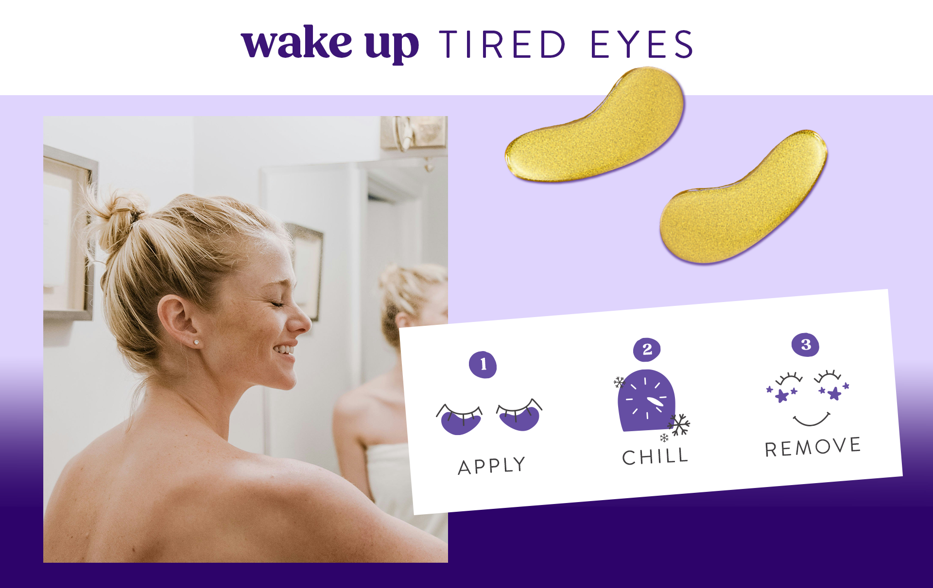
The Golden-Glow Eye Masks are the hero product of Dermora so we kicked off the rebrand with its packaging. In collaboration with the brand managers, we researched competitors with a focus on Amazon while also exploring skin care in brick-and-mortar. The current Dermora target demographic was women in their 40s and part of the rebrand goals was to expand to a wider age range, including a younger, gen z shopper.
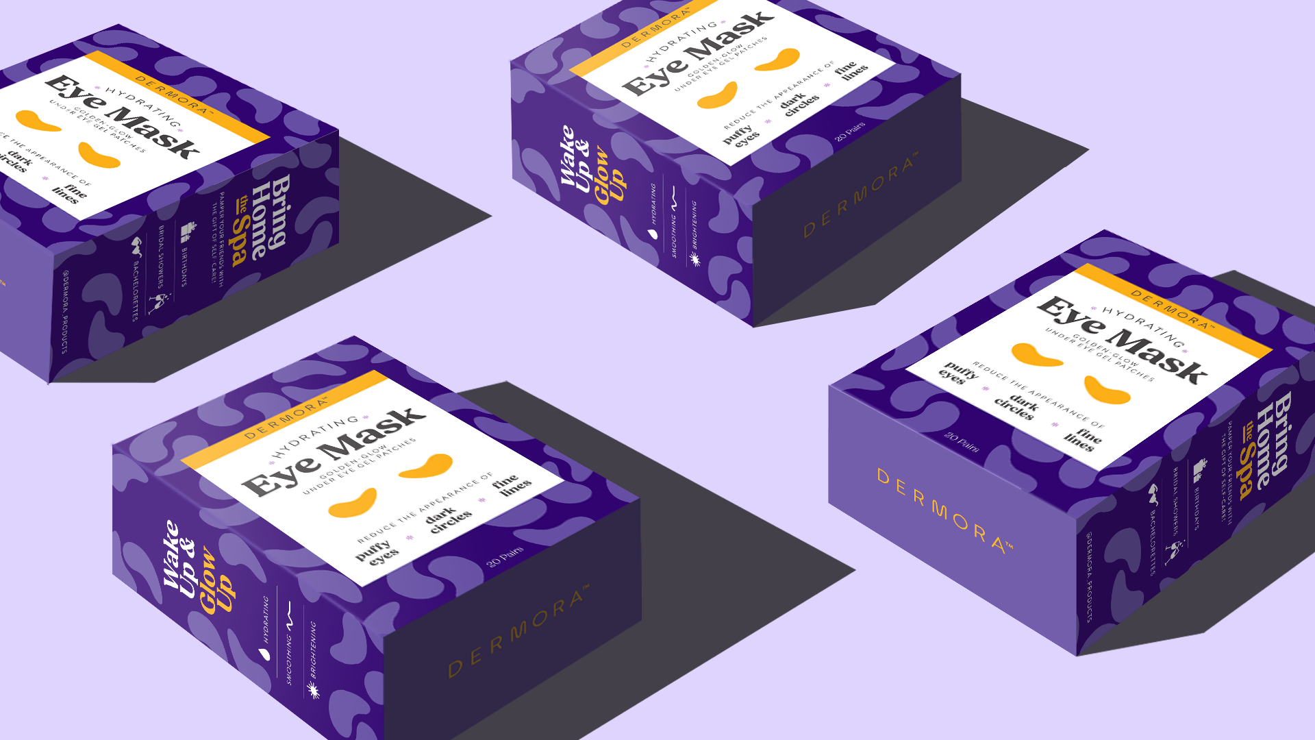
I explored a wide range of design options, from more elevated to vibrant and youthful. After initial reviews with the brand team and cross-functional partners, we narrowed down concepts and began initial testing against the current packaging to ensure we were going down a path that would align with our shoppers.
Included in explorations was updating the logo to better fit the brand tenants and increase the brand’s trustworthiness in the eyes of the consumer.
As a part of the tests, we tested color ways and copy hiearchy as well to set up a standard that could apply to the foot peels and future product launches.
After