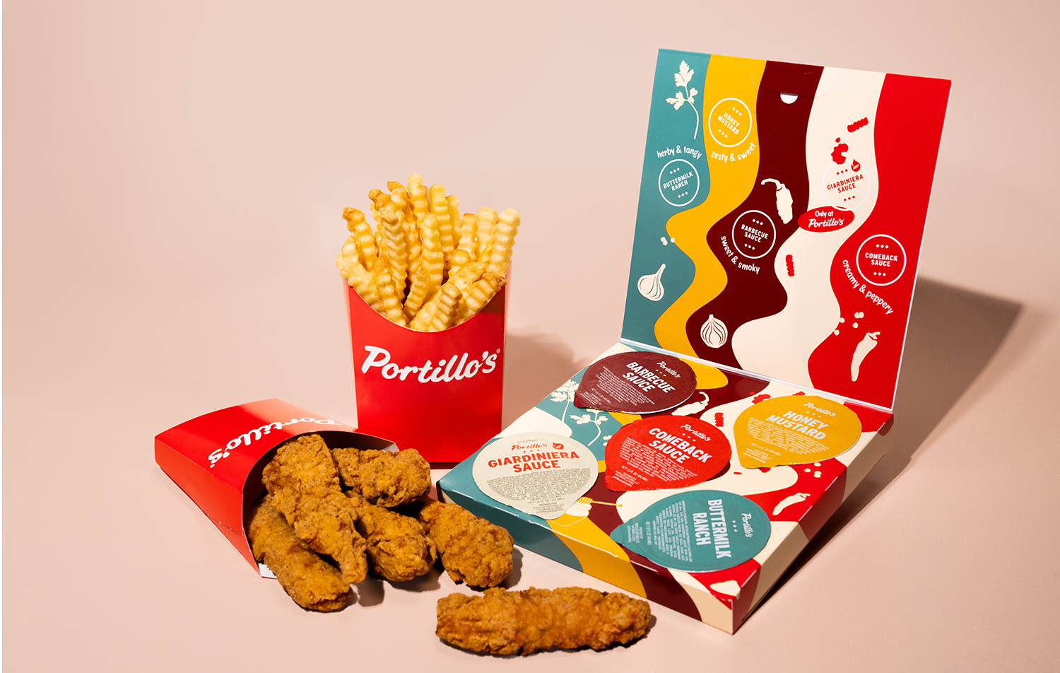
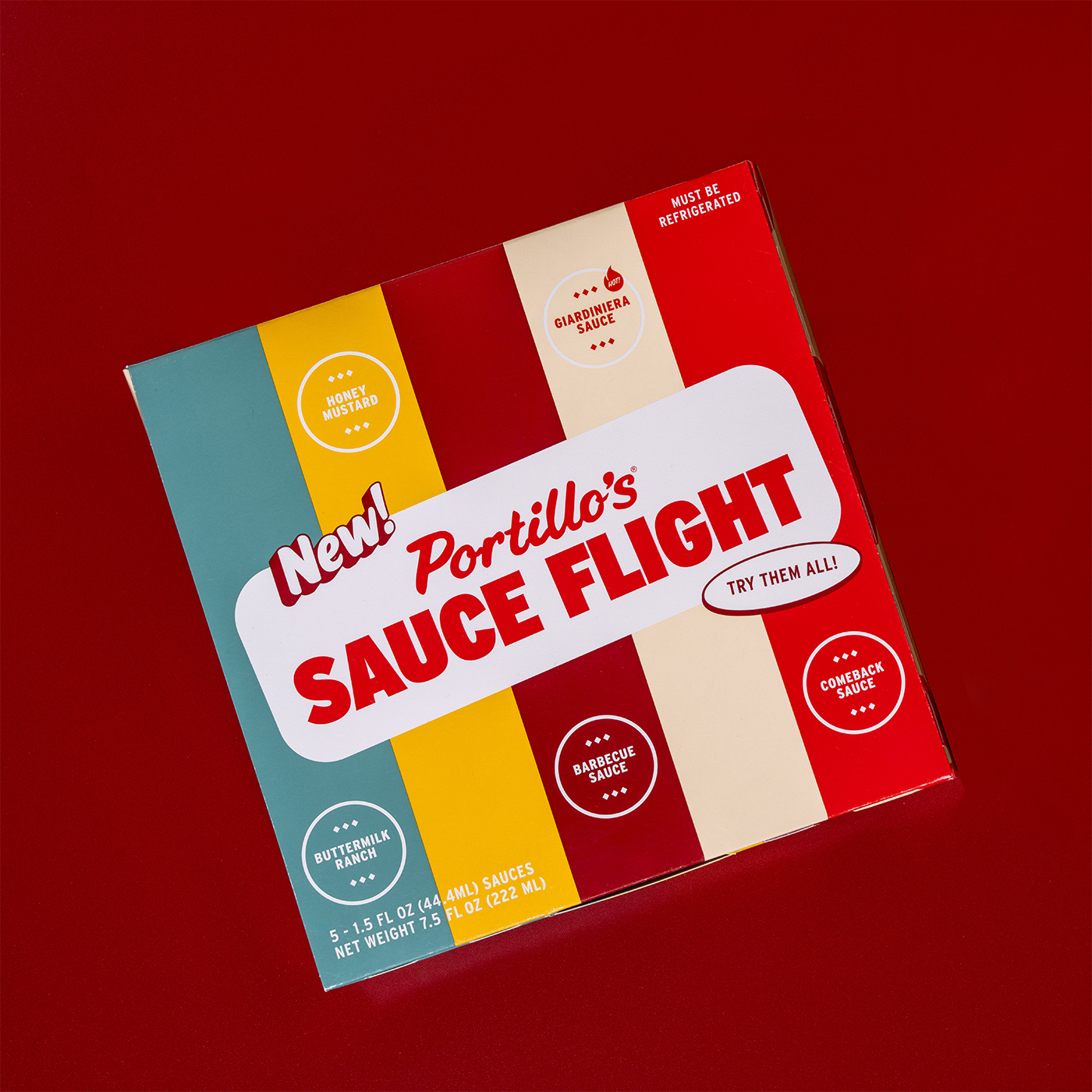
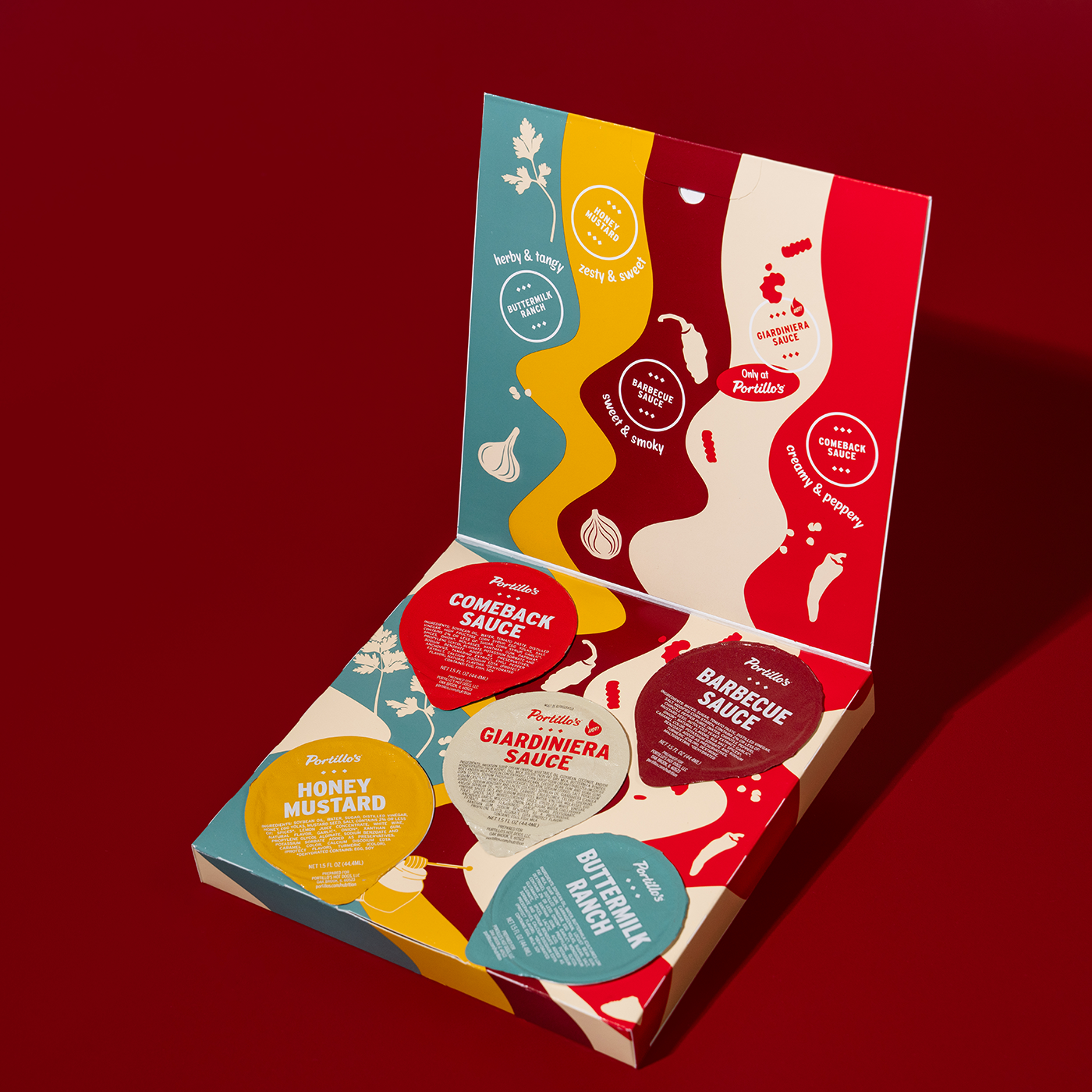
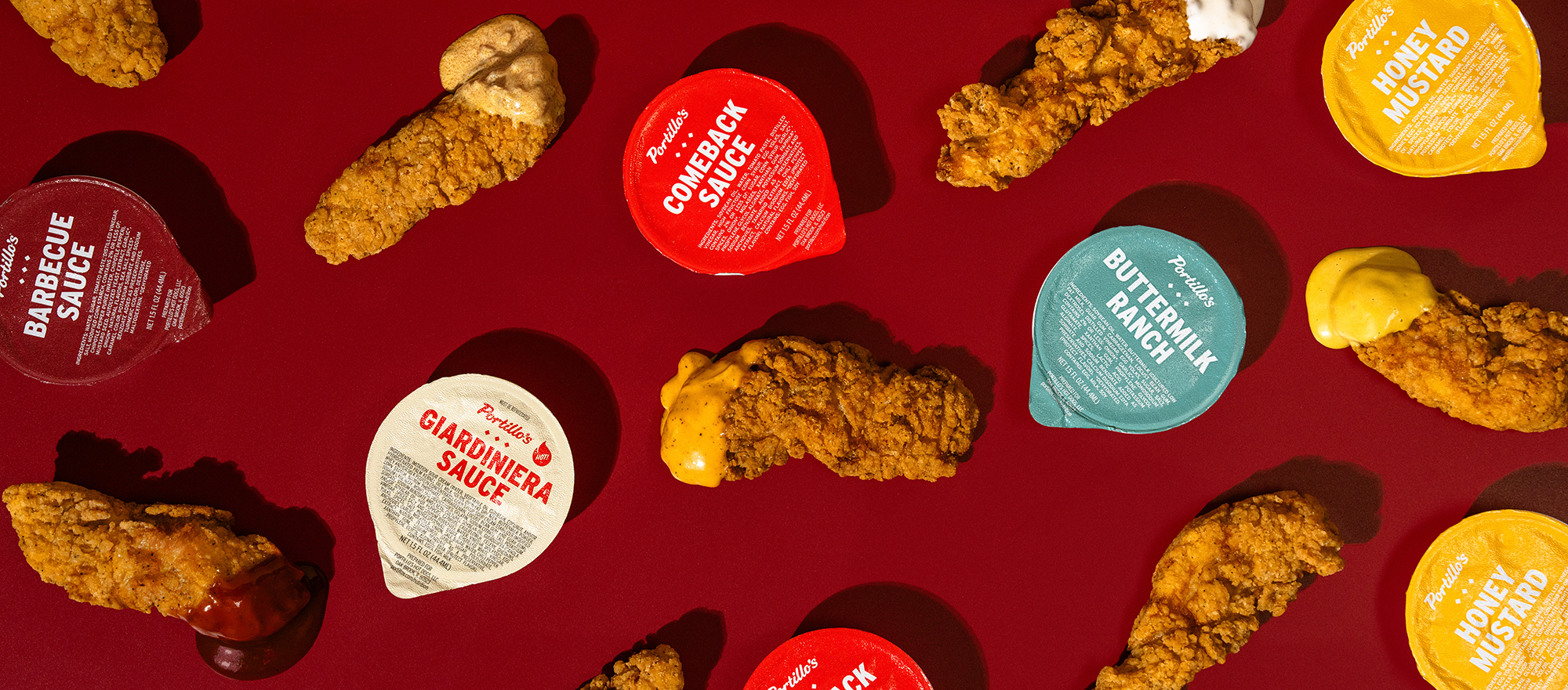
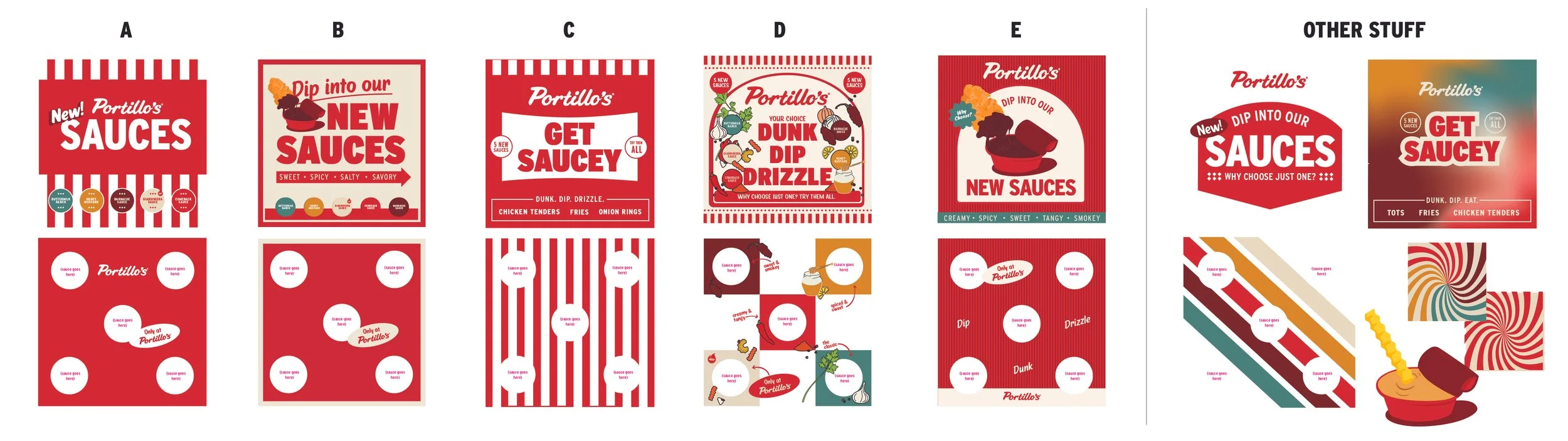
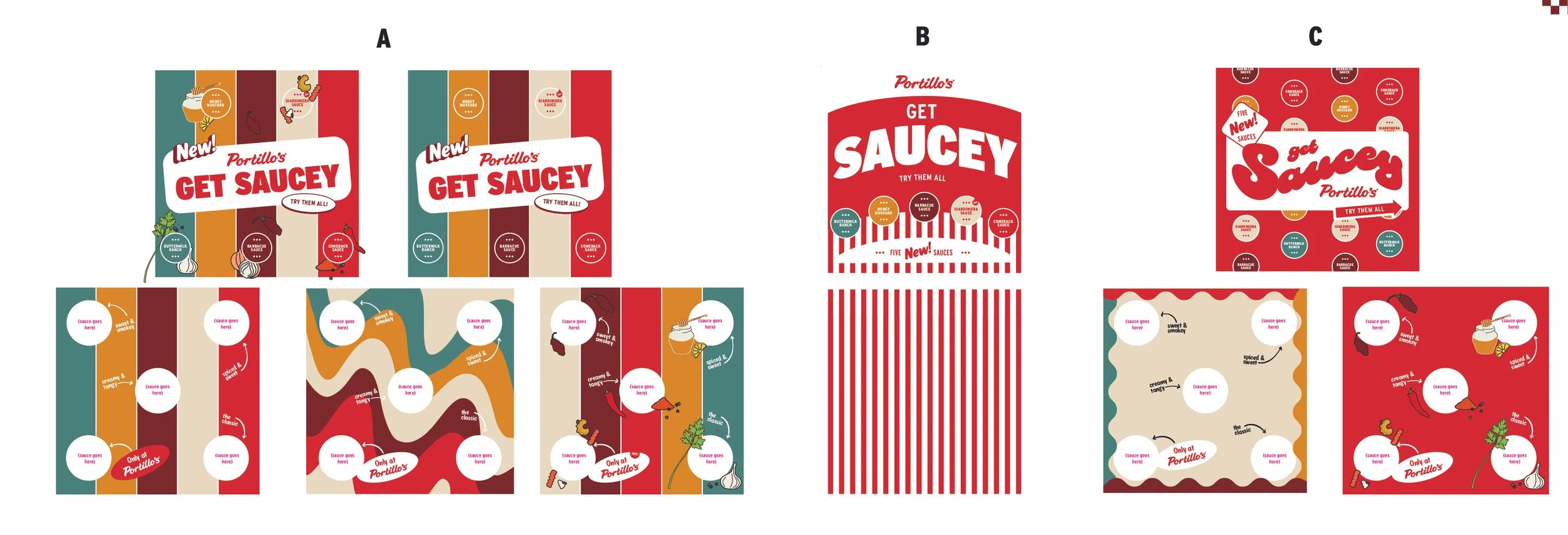
Portillo’s had plans to launch new sauces packaged together in a flight. The individual sauce labels and color palette had been decided providing guardrails for the flight box concepts. I collaborated with the in-house team to land on the final packaging design after reviewing several directions. The final leans into ingredient cues through illustrations and a retro-inspired groovy sauce pattern.
Portillo’s Sauce Flight
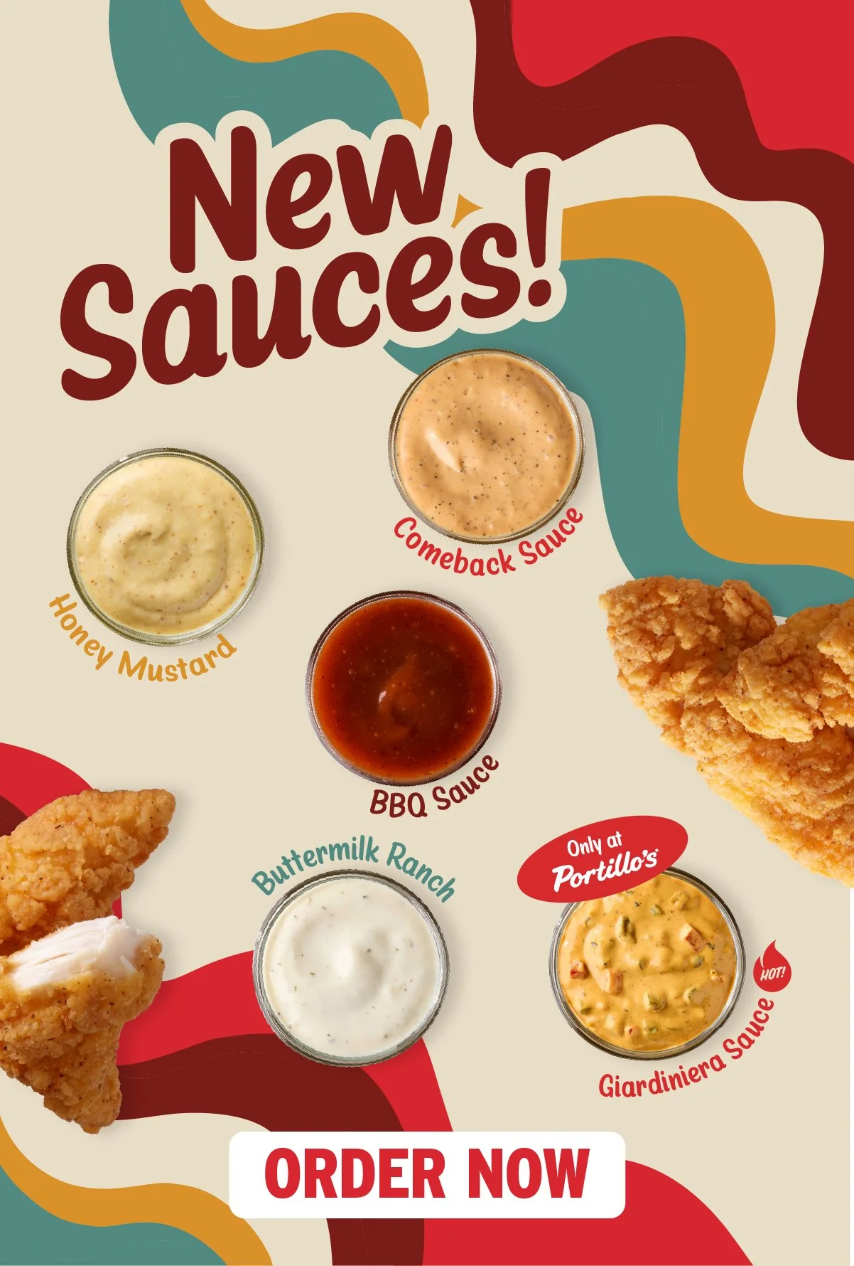
Portillo’s launched the flight in a news segment.
The Launch
They wanted to explore a few directions including “Portillo’s red,” retro, and choose-your-own-adventure. I had explored full color illustrations to nod to the ingredients and flavor profiles. After reviewing several iterations and ideas for the flight name, the Portillo’s team selected this concept to move forward with. It evokes the sauciness of the flight with rivers of sauce. For production, it needed to be maximum 5-colors which narrowed down the color palette and simplified the design.
Process
I created supporting launch assets including email and social posts. I animated the sauce to flow across the screen and intro each flavor.
Campaign Assets